
By Beth Inglis
I was searching for a way to visually and simply tell our story – to show what we do, how we do it, who we work with, and our history. I found when I gave clients and partners our old marketing materials, they took them, but they likely ended up in a pile on their desks. To find a better way to communicate our message and stand out from other companies, I turned what we do into pictures – into an infographic.
We created our first infographic last year. After doing a short test run, with positive feedback, we stopped distributing the old marketing materials and now solely use the infographic. We have print and electronic versions that we share with clients, partners, and our employees.
The infographic we use today has gone through quite an evolution from where it began.
As the designer and I created the infographic, we saved revisions to our company server for all staff to review and provide feedback. The process forced us to really clarify the message of what Preting does. At the end of the day, we revised the design 11 times to end up with the current version.
The following shows the evolution of the infographic so you can see where it started and where it is today.
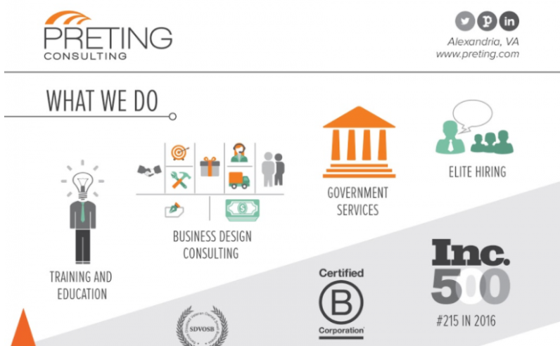
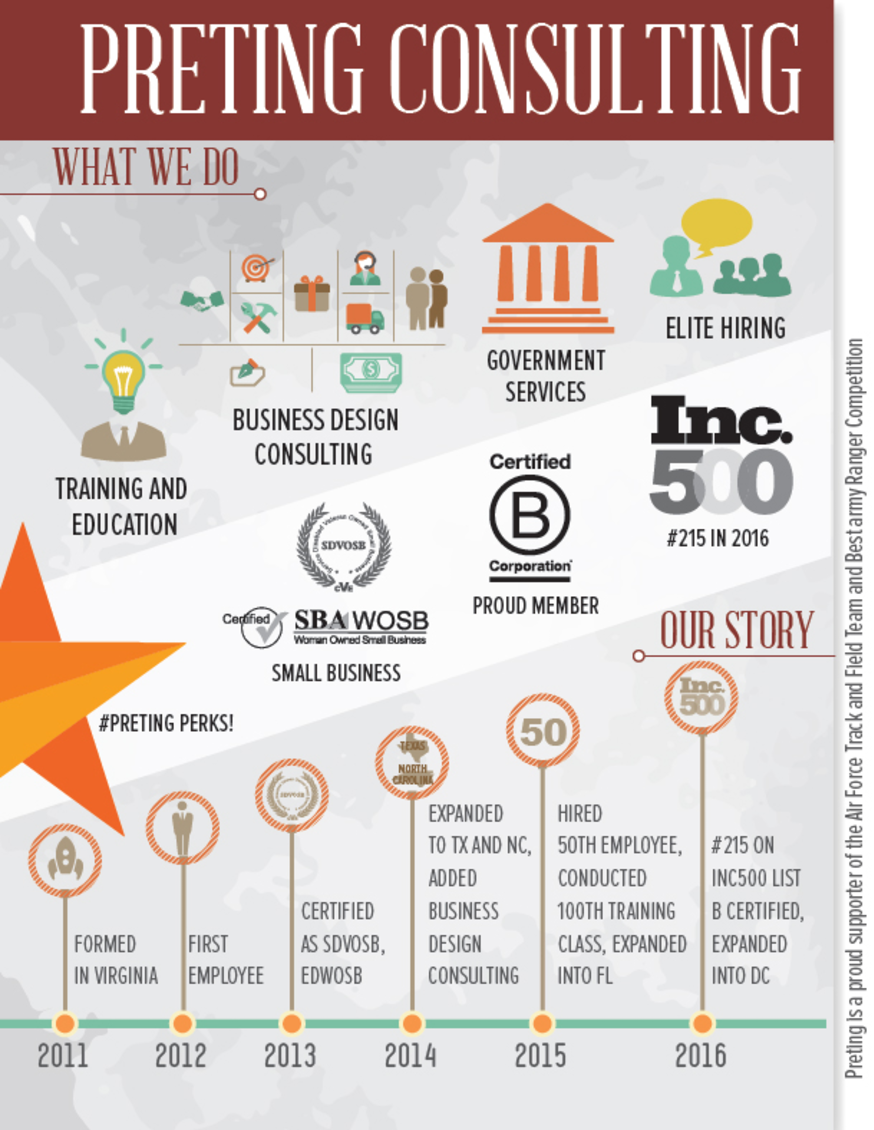
First Draft
Working with our designer, I realized after the first design that my instructions were too literal. One of the example infographics I provided to him was for Hawaii. We ended up with a more tropical feel than we wanted.
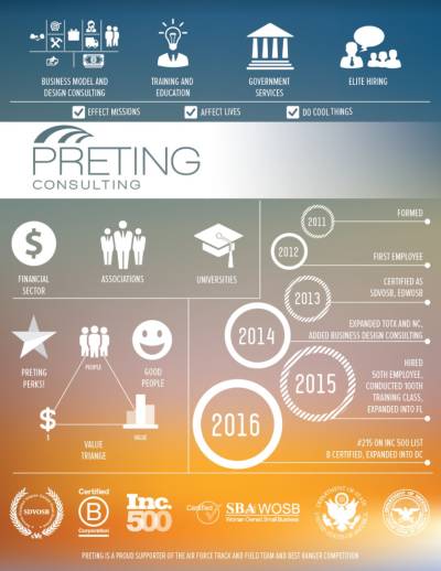
We shifted away from Hawaii, but kept the timeline and icons. The result was cleaner with a solid light background, but the icons were bigger than we envisioned, and the infographic seemed a bit clunky.
We spread the graphics out and put them into “sections” by What We Do and Our Story. We also experimented with banners – one at the top and a middle section that showcased Preting’s certifications and awards.
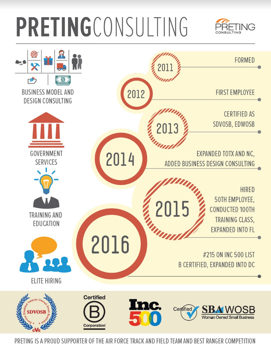
The structure of our fourth version was what we wanted. We then adjusted the headers and changed our partner icons to black, instead of in full color. We put them on a diagonal and adjusted the timeline to only be ascending, instead of ascending and descending at the end.
Revisions
We continued to tweak the background colors, fonts, and icon placements.
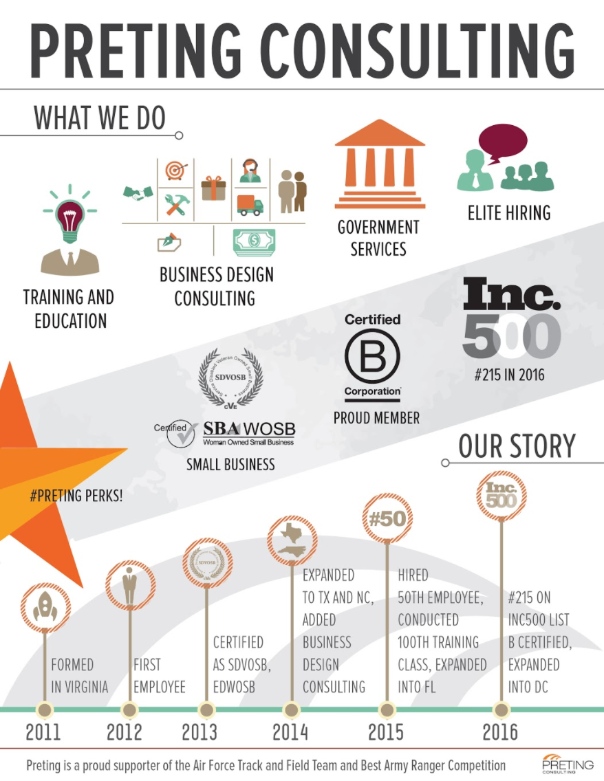
We added our social icons, location, and website address. We continued to adjust placement of icons and make subtle color changes.
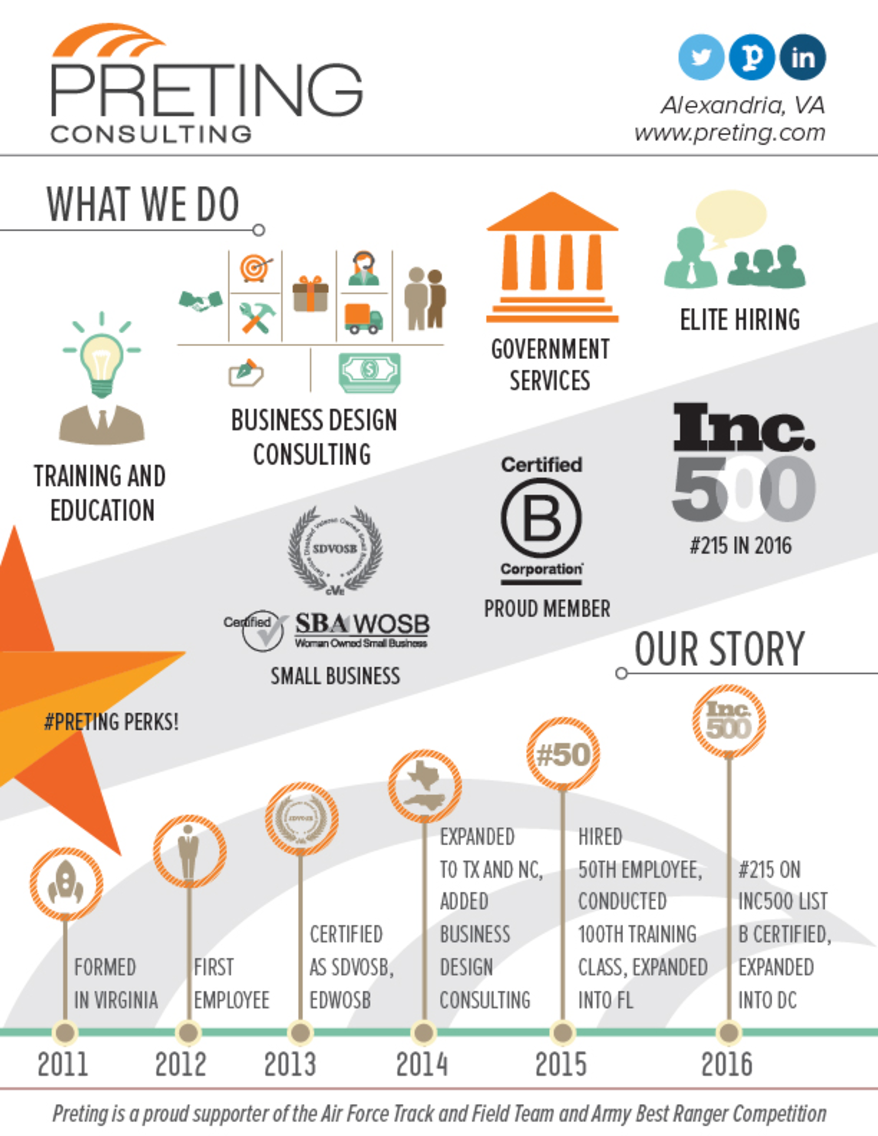
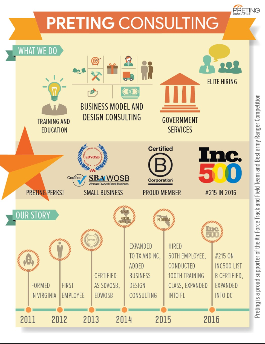
Final Infographic
We continued adjusting icons, sizes, colors, and fonts. Here is our current Preting infographic. It is simple, clear, and consistent with our company’s look and feel. We like that a 10-year-old can look at it and understand what Preting does.
As a small business with many capabilities it was tricky to sum up who we are and what we do into one page. Our goal was to clearly communicate our story in pictures, with limited words, yet still look and feel professional. Compared to the 2016 infographic, the 2017 version has more depth and tells our story more clearly.
If you’d like to learn more about what Preting does, who we are, and how we got started, download our infographic or contact me with questions.